Team and Retainer Reporting and Insights
Overview
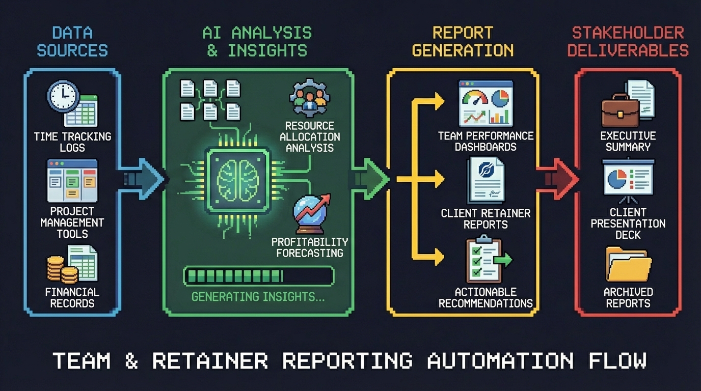
Reporting on team utilization and retainer usage should be straightforward. In practice, it wasn’t. Clockify’s interface slows to a crawl when querying across 40+ users and hundreds of projects. Trend analysis — identifying which retainers are consistently over or under, which users are tracking low — was done manually each month, if it was done at all. Exporting data to spreadsheets and manipulating it by hand introduced errors and ate hours that could be spent acting on the insights instead of assembling them.
We built an automated reporting pipeline that pulls data directly from the Clockify API, runs trend analysis against business-specific rules, generates interactive HTML graphs, and embeds the results in Notion pages that the team can access instantly each month. No exports, no spreadsheets, no manual assembly.
Approach
The pipeline was built using Gemini Pro to rapidly generate and iterate on Python scripts, with n8n orchestrating the entire flow from data extraction through delivery.
Gemini Pro for AI-assisted code generation. Rather than writing each script from scratch, we used Gemini Pro to generate the Python code with our specific business rules baked in — definitions for what constitutes systemic high usage, low usage, rollercoaster patterns, and billable tracking thresholds. The speed of being able to ideate, build, confirm, and iterate using business-specific rules was a game changer. What would normally take days of development compressed into focused sessions of prompting, testing, and refining.
n8n as the orchestration layer. All Python scripts run inside n8n workflows, triggered on a monthly schedule. n8n handles the sequencing — data extraction first, then analysis, then graph generation, then upload — and provides logging and error handling across each step.
Clockify API to CSV. The first set of scripts connects to the Clockify API, pulls time entry data across all users and projects, and writes structured CSV files. This eliminates the manual export step entirely and ensures the data is clean and consistent every time.
Graph generation. A second set of Python scripts reads the CSV output and builds HTML visualizations — interactive graphs that surface the trends and patterns the team needs to see. Each graph is purpose-built for a specific analysis type rather than a generic dashboard.
Google Cloud Storage for secure hosting. The upload script pushes the HTML graph files to Google Cloud Storage, overwriting the same filenames each month. The files are secured behind proxy authentication so only Goose Digital users can access them. Because the filenames stay constant, every Notion embed that references them automatically shows the latest data without anyone needing to update links.
Notion as the reporting surface. Notion pages embed the hosted graphs directly, giving the team a single place to review retainer health and individual utilization each month. No new tools to learn, no logins to manage — just open the page and the current data is there.
Results
The pipeline produces two levels of analysis, each designed to surface patterns that were previously invisible or inconsistent.
Retainer customer-level analysis identifies usage trends across the full retainer portfolio. Four classifications help the team prioritize where to focus attention: Systemic High Usage flags retainers that are consistently over-allocated, Systemic Low Usage identifies retainers that are chronically underutilized, Rollercoaster Usage highlights retainers with volatile month-to-month swings, and Total Retainer Usage provides the baseline view across all accounts.
User-level analysis surfaces individual utilization patterns. Systemic Low Billable flags team members whose billable hours are consistently below target. Systemic Low Total identifies users with low overall logged hours. On Track Billable confirms users who are meeting their billable targets consistently.
Monthly reporting went from hours to seconds. The entire pipeline runs automatically. Data is extracted, analyzed, graphed, and published without anyone touching a spreadsheet or running a manual export. The team opens Notion and the current month’s data is already there.
Human error dropped to zero on the data side. No more copy-paste mistakes, formula errors, or version confusion from passing spreadsheets around. The same scripts run the same way every month, producing consistent and auditable output.
Lessons Learned
-
AI-assisted code generation with business rules changes the economics of internal tooling. Using Gemini Pro to generate Python scripts against our specific definitions — what counts as “systemic high,” what threshold triggers “rollercoaster” — meant we could build custom analysis that would normally require a dedicated development effort. The iteration speed made it practical to experiment with different classification approaches until we found the ones that actually surfaced actionable patterns.
-
Overwrite the same filename to keep embeds alive. A simple design decision — uploading each graph to the same Cloud Storage path every month — eliminated an entire class of maintenance work. Notion pages never need updating because the embed URLs never change. The content behind them just gets fresher.
-
Proxy authentication is the right middle ground for internal tools. Hosting the HTML graphs on Google Cloud Storage with proxy-based access control meant the team could reach them from Notion without VPN hassles, while keeping the data restricted to Goose Digital users only.
-
Separate extraction, analysis, and visualization into distinct scripts. Breaking the pipeline into three independent stages — pull data, run analysis, build graphs — made each piece testable and replaceable on its own. When we wanted to add a new classification type, we only touched the analysis script. When we wanted to change how a graph looked, the data pipeline didn’t care.
-
Notion is an effective reporting surface when you remove the data assembly step. The team had always been capable of analyzing retainer data — the bottleneck was getting clean, current data in front of them. By embedding auto-updating graphs directly in Notion, we turned reporting from a monthly chore into something the team actually uses proactively.